
Sunny greetings, dear reader!
Icons often look like the safest choice in global design, but cultural context can quickly turn them into a liability, while English sentence structures crumble in Korean or Arabic.
When icons don’t speak the same language
Icons feel universal – a picture speaks louder than words, right? Well, not always.
The “OK” sign (a circle formed by the thumb and index finger) shows approval in the US, but in Brazil and parts of the Middle East it is considered a vulgar insult. Another example is crossing fingers for good luck. This is common in the US and the UK, but in Germany people press their thumb to wish good luck. In Vietnam, crossed fingers can mean something entirely different and have nothing to do with wishing good fortune for others.
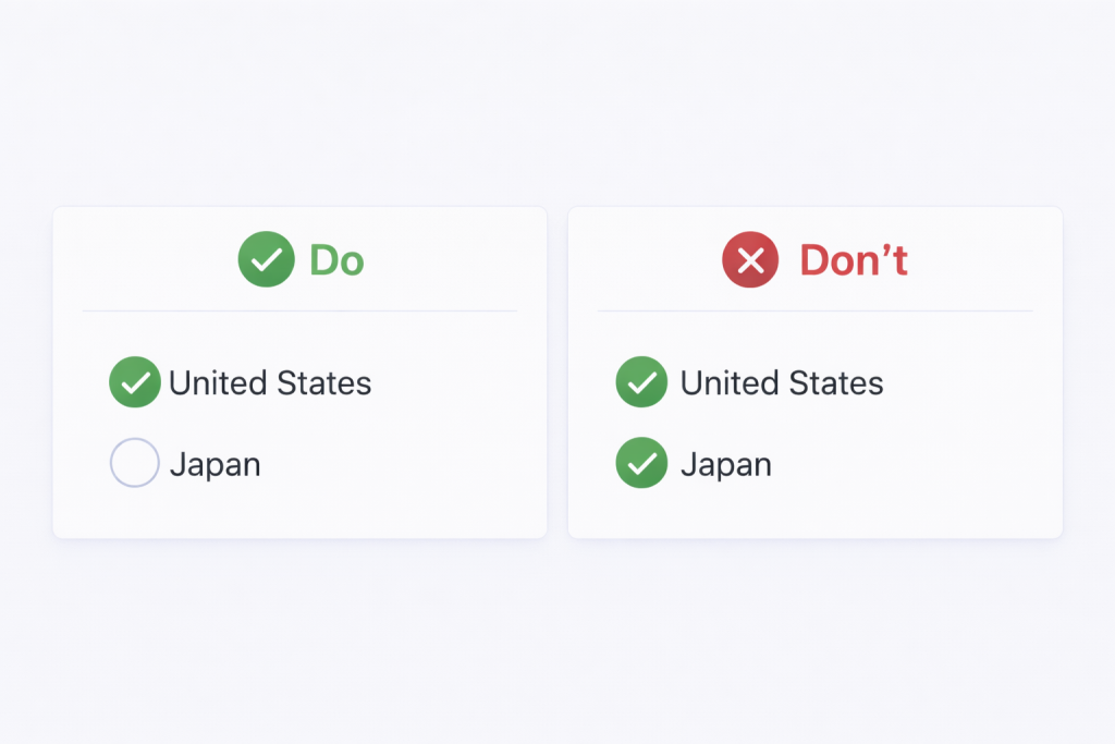
We keep on going with the visuals. This time looking at the check mark. In the United States, it’s commonly used to indicate that something is correct, whereas in Japan a circle is used to mark something as correct. In contrast, a check mark in Japan is often used to indicate that an item is incorrect.
Designer’s fix:
- Don’t assume your icons are globally intuitive
- Validate critical icons with local teams, localization teams or user research
- Add text labels for clarity (especially on first use)
Pro tip: Always pair icons with text labels – what’s intuitive in one culture may be confusing in another.
Word order: the silent layout killer
In English, word order feels predictable. Subject (S). Verb (V). Object (O).
But that structure doesn’t hold up everywhere.
Some languages follow SOV (like Korean), others VSO (like Arabic).
French places adjectives after nouns. German splits verbs apart (you might ask “why?”, well, because we can 🙂).
Japanese often uses no spaces between words.
Spanish adjusts articles, adjectives and verbs based on gender and number.
When designs assume English word order, they break.
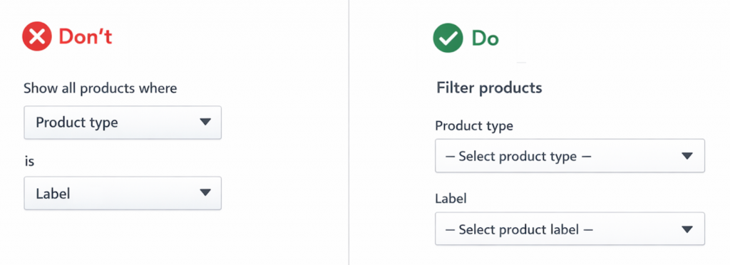
Splitting phrases across UI elements or embedding fields inside sentences, locks the structure in place. Once translated, those fixed strings can become awkward, incorrect or impossible to localize.
Here is an example of a layout that makes it difficult to be localized with a solution side-by-side.
Designer’s fix:
- Keep each phrase together as a single unit
- Use short, standalone labels instead of full sentences
- Avoid placing form fields or buttons inside running text
Pro tip:
Always assume word order will change in translation. If your UI only works in English, it doesn’t really work globally.
Overview of the “Global design” series:
Where sleek UIs meet linguistic reality
When layouts flip and fonts fight back
From colors to calendars: surviving global UI
When icons misbehave and sentences rebel
Flags aren’t neutral, formats aren’t simple
The final frame: imagery insights to nail your design
Leave a Reply