Sunny greetings, dear reader!
Global design is full of hidden traps – some political, some purely cultural. It’s about avoiding hidden landmines. Flags that seem harmless can spark political debates.
Phone numbers, addresses and currencies that seem simple in one country can completely break your forms in another. In global design, even small assumptions can become big problems.
The hidden risks of flags
This is a topic near and dear to my heart. Using flags to represent countries or languages may seem harmless but it can create legal risks and public backlash.
For example, using the Taiwanese flag can trigger issues in China. Using the Chinese flag for Taiwan can cause problems in Taiwan. In both cases, products risk being blocked or facing public criticism.
Flags are political symbols, not neutral design elements. That’s why large companies like Microsoft and Apple have removed flags from language and country selectors and introduced strict internal guidelines.
Rule of thumb:
Don’t use flags to represent languages or regions, especially in menus and pickers.
Good to know:
- Maps can be very political as well. (Quick note: Google Maps changes place names depending on your location. In the US, you might see Gulf of America, while in Europe and many other regions, it appears as Gulf of Mexico.)
- Not every region is a “country” – ignoring this can cause legal headaches
Designer’s fix:
- Use language names written out (for example, Deutsch instead of 🇩🇪)
- Use “Country/region” for labelling country picker
Pro tip:
If a design choice might spark a political debate, it doesn’t belong in your UI.
Formats, take two: handle with care
We’ve already talked about dates, times and addresses, but there’s more – much more! Phone numbers, currencies, units, keyboards, punctuation and symbols all vary around the world. Designs that assume a single format can break in other markets.
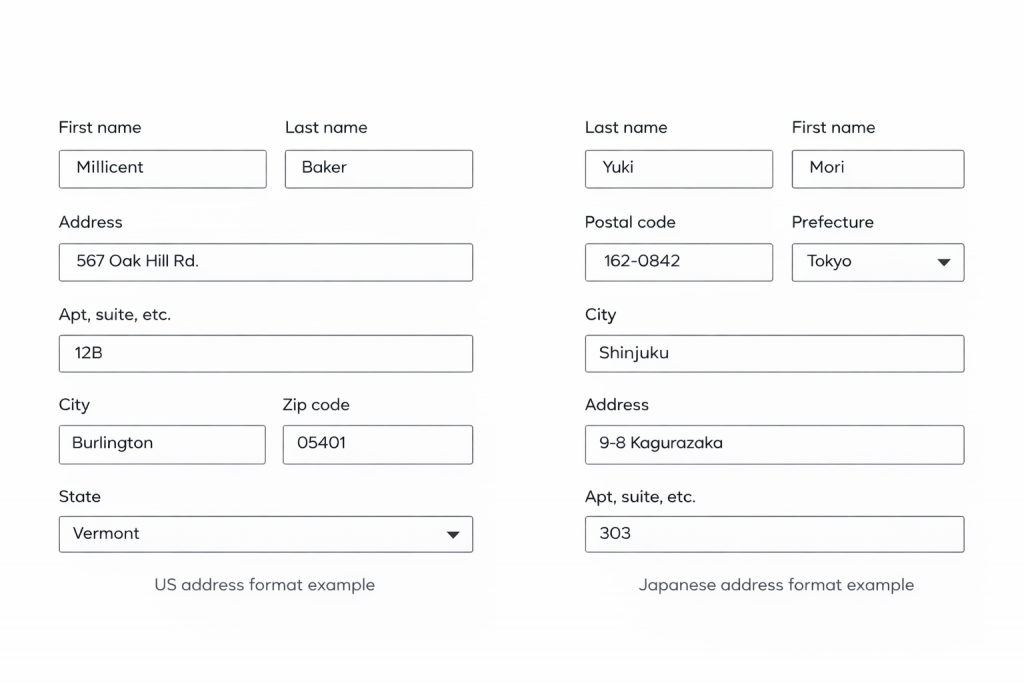
Let’s take a look at different address formats.
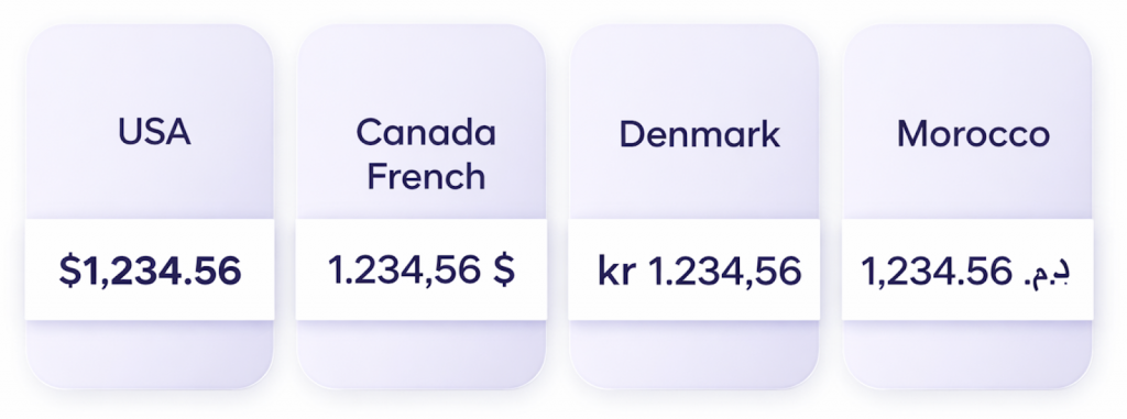
And here is an example using currencies. The currency symbol for the US dollar appears in front of the number with no space, and the thousand separator is a comma, with a full stop introducing the cent amount. The Canadian dollar, however, starts with the number and uses a full stop as the thousand separator and a comma for the cent amount, followed by a space and the dollar symbol.
Here is something else to keep in mind. Low-value currencies can wreak havoc on your layouts. For example, $1 in Vietnamese đồng is about 25,970 ₫. A field designed for three digits suddenly needs room for five or six.
Always check with your developer or localization team before finalizing forms, labels or input fields. Cultural formats influence both usability and legal compliance.
Good to know:
- Currency symbols can go before or after the amount with space or no space. Don’t assume one.
- Currency symbols aren’t universal. A single symbol like $ can represent multiple currencies, so always design with clarity and context in mind. For example, $ in the US, Canada, Australia and many Latin American countries.
- Name order and spelling isn’t universal. Getting it wrong can be impolite.
- Not all regions use the same decimal separators
- Plan for more space as amounts can expand
Designer’s fix:
- Keep fields flexible for multiple formats
- Avoid hard-coded formats in UI
- Collaborate with localization team early to anticipate differences
Pro tip:
Design with flexibility in mind. Anticipate differences, don’t force a single format.
Overview of the “Global design” series:
Where sleek UIs meet linguistic reality
When layouts flip and fonts fight back
From colors to calendars: surviving global UI
When icons misbehave and sentences rebel
Flags aren’t neutral, formats aren’t simple
The final frame: imagery insights to nail your design
Leave a Reply