Sunny greetings, dear reader!
Think your UI is ready for the world? Think again. The cleanest layout can fall apart under the weight of longer words. Localization is where your sleek design meets reality and sometimes it gasps, flips or completely misreads the room.
This is the beginning of our new series “Global design”. Before we dive in, I would like to address the elephant in the room. I am not a designer and all the illustrations in this blog are powered by AI – if we were to do them ourselves, this blog would be without any imagery, as we are operating on a dime here. So please don’t be too offended by our attempts to give you visual examples. But now, let’s dive right in.
The button that couldn’t breathe – text expansion in design
If you’ve ever worked on a sleek, pixel-perfect UI and then seen it collapse into chaos after localization, you have probably met our old friend: text expansion.
Take the humble “Retry” button. In English, it looks neat. In German, suddenly it turns into “Erneut versuchen” and refuses to fit into the carefully designed rectangle. The button starts gasping for air.
This happens because words in other languages can be 30 to 40% longer (or more!) than their English counterparts. Finnish and Russian are notorious for this, too. What looks clean in English becomes a UI nightmare abroad.
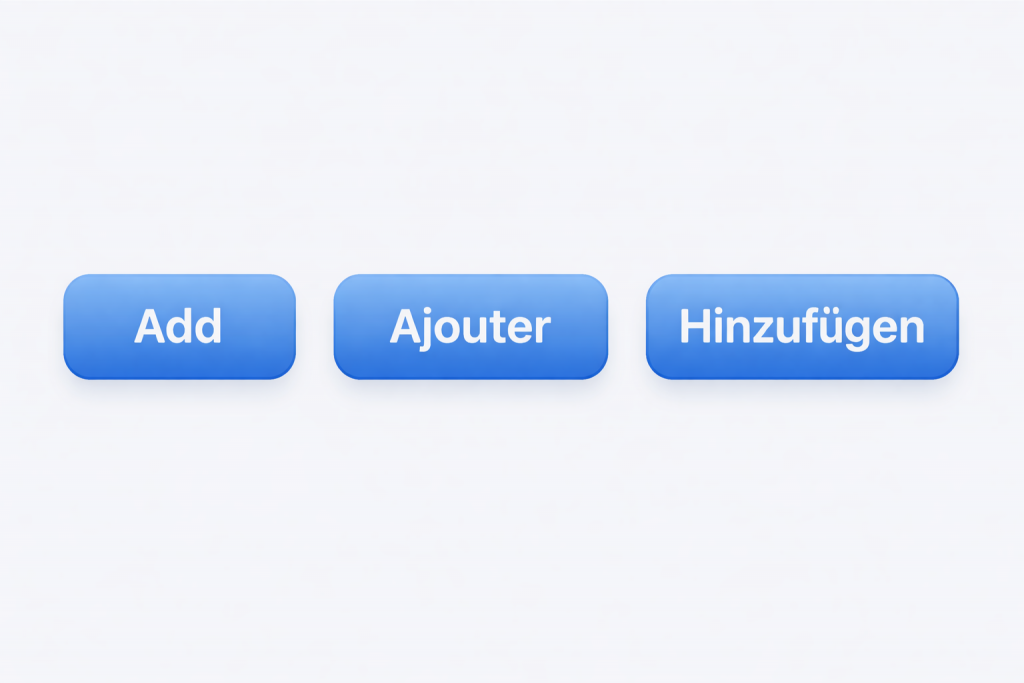
Visuals are always best. To demonstrate the extension in other languages see the below buttons. Here you see the English button “Add” (100%), the French “Ajouter” (137%) and the German “Hinzufügen” (182%).
Good to know:
- Some languages use way more characters than English – sometimes even double
- Abbreviations? Not always possible.
- Hyphenation and automatic line breaks differ by language
- Short words can expand a lot, up to 10 extra characters, sometimes 300%
- Compound nouns with no spaces (like German “Produktionsplanungssystem”) make wrapping tricky
- Use pseudolocalization to preview how designs will look in other languages. Ask your dev team or localization team for details.
Designer’s fix:
- Give text breathing room – don’t lock buttons and menus to a single width and height
- Use auto-resizing, but add limits to prevent text from overflowing
- Allow line wrapping where possible
- When placing text and a button on the same line, plan for expansion. Once the size reaches a limit, place the text on one line and the button on the next. Check out this useful webpage.
Pro tip: Test your design with, for example, German or Finnish text before design freeze. Test a language with short strings, like Japanese, to see how the UI holds up with sparse content and a different height requirement. If it survives those, it will survive most languages. For this, you don’t need real human translations. With machine translation or the above mentioned pseudolocalization, you can get an idea of how things are looking.
Tooltips, popovers and the expansion monster
Tooltips are the hidden troublemakers of localization.
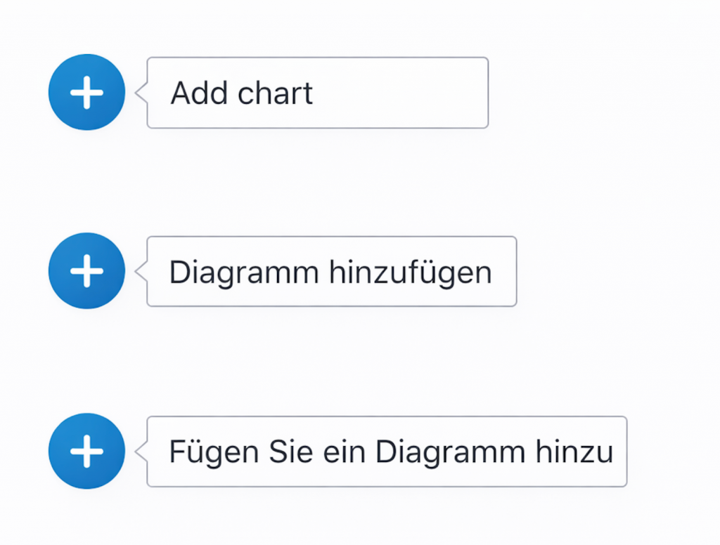
In English, your tooltip might say “Add chart”. In German, it becomes “Diagramm hinzufügen” (infinitive version with a noun) or even worse “Fügen Sie ein Diagramm hinzu” (imperative style). Suddenly it’s much longer and breaks out of the container.
Here is a visual because visuals are always great.
Popovers suffer the same fate. A neat one-liner in English turns into a paragraph elsewhere. This is basically the same issue we just discussed with the buttons.
Designer’s fix:
- Let tooltips and popovers wrap naturally
- Test for maximum expected length, not minimum
- Avoid cramming too much critical info into these tiny UI spaces
Pro tip: If a tooltip takes more than two lines in multiple languages, maybe it should not be a tooltip at all.
Leave a Reply